Introduction


Follow my journey, my struggle to success.
You can learn more, or you can learn less.
Enjoy the artwork, read what you will.
Don't be afraid to share your own skill(s).


This blog is now Mili Fay Art Blog


Monday, 8 April 2013

"Mili Fay's Adventures in Publishing": Part 02--BOOK PORTRAITS

Because of the surprisingly early Easter this year, it took a bit longer for me to get my CIP information, but in the end that proved to be a very good thing.  Someone out there really is watching over me, and I am much happier with the book in the state it is now than it was three weeks ago.

However, I'm getting ahead of myself.

Let me continue from where I left off the last time; I have selected my printing company and I've been waiting for CIP before I could proceed with printing.

Instead of just waiting for the information to arrive, I decided to use those 10 business days to create my author's portrait and to paint my grandfather's portrait (this book celebrates his memory) in watercolour.  Previously these would have been photographs, but I believed that watercolour portraits would look much better with my watercolour book.

So, I pulled out my brushes, set up my paper, found a col-erase brown pencil and began.

Have you ever tried to paint a portrait in watercolour?!!!

I truly understand why most artists prefer oil and acrylic.  The next time I come across an artist who works in watercolour portraits, I will bow down before him/her and celebrate his/her genius. 

When painting with watercolour you have almost no room for error.  One little mistake and hours of work are ruined, and unless you are going to edit the work digitally, there is nothing you can do, but start again, and again, and again...

The accuracy and precision of mixing tones, drawing lines, deciding what should be prominent what should fade--I have never struggled with portraits this much in my life!

To illustrate the horror, I'm going to reveal my shamefully horrible attempts, that will make you wonder if I have any talent at all.


What you see above is the image of my late grandfather.  This picture has been scanned from his passport photo upon his death.  It has been enlarged and printed, and now I've scanned it again, because the original scan is on my nearly obsolete laptop.  This is the image I've used as photographic reference.

(Note: camera distorts an images, therefore when you paint from the photograph, you will have to try to compensate for the distortion.  However, this image is fairly accurate).


The above is my first attempt at watercolour painting.  

It is so distorted! 

My grandfather is almost past the point of recognition.  Believe it or not, it began as a fairly accurate sketch.  Then as I was painting, somehow his chin grew out of proportion.  I was also trying to make him look a bit more cheerful... It didn't work out.  The last horror is they eyes.  I liked the intensity of the dark eyes in the photo, but with the rest of the painting, they look too dark--like two holes.  And I do not even want to mention the eyelashes...  He looks as if he is wearing mascara!

After a good night's sleep, I tried again.


This painting IS my grandfather.  The way I remember him; sad eyes, kind face and older than he is in the photograph.  When I look at this photo, I feel so much emotion.  That is how I know it works.  It is not a copy, but an accurate representation of who my grandfather was.  The eyes still are dark enough to remain the focus, but are light enough that they fit with the rest of the picture.  This is the portrait I'm using, and I'm extremely happy with it.  To original will be sent to my grandmother.

I was so happy with this portrait, that I decided to attempt painting my author's portrait immediately.

Now, you need to know that I do not like to paint and draw myself.  It feels very weird to me.  Whenever I paint, I try to emotionally connect with the person I'm painting, but emotionally connecting with myself...  It's weird.  Also, my vanity kicks in.  I do not think I'm beautiful, but I have the skills to make myself beautiful, so it is very hard for me not to attempt to do so.  Then, I'm not really sure I want everyone on the net see my face.  All of these factors crate an internal struggle that interferes with my work--something I do not have when I paint other people.  When I paint others, I think about how happy they'll be with the job well done, and I try to find their true self, creating a little story about them in my mind.


This is the first picture I decided to use as the reference.  The slick hair worked with the outfit, but here it looks rather flat.  Also I cannot use the shadows which are in this photo, though I do like them.  Then, my nose which is rather long (courtesy of my grandfather) looks even bigger due to the distortion of the lens.
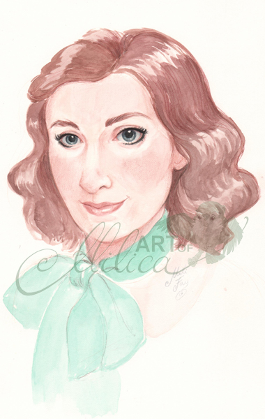

This is my first attempt.  I do not usual swear, but "What the #$%@?!"  How can I paint such a beautiful portrait of my grandfather, and then end up with this.  It looks nothing like me--well maybe my eyes.  The portrait does look slightly like my grandmother, but it looks more like a doll than a real person.  One of those cut-up dolls of the 60s or something.  I wish my skin was that healthy, but it has not looked like that since I was 19.

A complete and total miss.


I've decided that the shadows were at fault, and that painting form that photo would be too difficult.  So, I got my photo from September 2012 (when I was leaner), the one currently found on my Facebook Page and on my webpage Contact Me page.


This is the result of that attempt.

To be fair I was working from screen, but once again, "What is this?!"

It looks like a very slutty version of me.  Completely inappropriate for an author's photo.  What WAS I thinking?  Not to mention the proportional inaccuracy.  Believe it or not, this portrait started out fairly accurate in the pencil sketch, but I must have fudged a line here an there while I was painting, and now it does not look very much like me.  Maybe I was tired.  Maybe that explains the slumberous look in my eyes, and the overall appearance of me rolling out of bed.  (I believe I finished this near midnight.)

The next day, I pulled out another photo.


I like this picture.  It is the traditional author portrait pose.  I look kind, approachable, with a sense of humor.  A good representation.

This is the result of that portrait.


I was trying to create intense eyes--I should have left them alone--this is what happens when you overwork your image.  I do not hate this portrait--though that right eye has the wrong tilt (stupid watercolour, I can't go and fix it, unless I play with the thing digitally).  What I do not like about it is that I look as if I am smirking.  Maybe the shadow around my mouth is too dark, and my lips are slightly off...


This picture I took with a specific purpose in mind.  It is to be the welcome image of my new website (still in development).  I am looking at Artemis (my owl--the one I use as my logo).  I love this photo of me, and so, I decided to give it a try.


This is the finished result, and this is the image I'm using for my author's photo.  Yes, my chin is a bit longer, and my nose a bit shorter--but at least this one looks somewhat like me.  I love the way Artemis turned out, and I believe the whole image represents Mili Fay of Mili Fay Art.

I discovered that the key to painting watercolour portraits is to keep them light.  Once you start painting deep shadows, and rounding the form,... The painting tends to loose that light spontaneous feeling and becomes very... Solid.

What is good about watercolour portraits is their ethereal quality, and the next time I paint one, I will try to remember that.

All I know is, the above picture will serve it's purpose, and I do not want to paint myself at least for another 5 years! 

I will write more about receiving my CIP, and my new-found mission next time.  For now, keep practicing, and if you know an amazing watercolour portrait painters let me know.

Cheers!

M

Friday, 29 March 2013

Where To Sell Your Artwork

In Toronto I have just discovered a new initiative to help artists, self-publishers, designers, etc., to sell their work. If you are in the area feel free to check out this event on April 13th at Gladstone Hotel.

Below is a post that explains why the Toronto Indie Arts Market came about:

http://www.stainedpagespress.com/2013/01/29/a-brief-digression-the-toronto-indie-arts-market/

M

Tuesday, 19 March 2013

"Mili Fay's Adventures in Publishing": Part 01--Printing


"Animals In My Hair", my first picture book, the one I have spent years working on between other jobs is finally ready for printing!

What now?

You will be amazed by all the things you need to know before you can print a book.  Thankfully, my sister found a self-help book, "Self-Publishing In Canada" by Suzanne Anderson, that gave me (what I pray) is all the information I need.

(When I was researching publishing, I found a lot of books on US publishing, but the one above is the only one I found that deals with Canada specifically.  I'm publishing in Canada, so it is helping tremendously.)

My adventures in publishing began the moment I finished all the illustrations, printed and bound a miniature version of my book.


"Why did you make a miniature version of your book?" you ask.

Because, I wanted to work out any problems the book may have before it goes to printing.

It is a very good thing I did so, because the next step--getting the ISBN number--asks a lot of question that you need to answer before the government issues a free ISBN number to you.  (You can find all the ISBN information you need at The Canadian ISBN Service System.)

After getting my ISBN number, my next step was to find a printer.

I wanted to have my book printed in Canada, so I searched all the printing companies in Canada.  Again, there were many questions to answer, half of which I had no idea what they were asking about, but research and some very helpful people came to my rescue.

Some companies were quick to respond to my request for a quote.  Some said they will give me a quote soon, but appear to have forgotten about me.  A bunch did not even respond with the simple courtesy e-mail that lets me know they have received my information.

Guess which companies I liked?

Another thing that surprised me is the cost of printing a book in Canada, as well as the lack of traditional hard cover binding.  There were so many printing companies out there that only offered binding of the kind you can find at your local Staples.

As any other publisher I need to have my book printed at the lowest cost possible, with the highest quality possible.  The quality of my book is not negotiable, because if Mili Fay Art stands for anything it is the quality of the current and future products.  If I do not want to have something on my shelf, or wall, why should I expect anyone else to want it?

Another reason I need the lowest cost possible is because I want to use my artwork to help worthy causes.  This book is intended to help wildlife conservation efforts by raising funds for the Toronto Zoo.  (I thought about raising funds for WWF, but they already have so many donors, I figured I can make more impact locally.)  After reading the report sent to me by the Toronto Zoo (I am a proud member), and realizing that they are desperate for non-government funds, I've decided to make them the beneficiary of "Animals In My Hair."  Therefore, if the cost of a single book is too high, I will not be able to raise a substantial amount of money after paying back my loans.  I'm also wondering how much retail stores will charge to carry my book...

At this time, I'm thinking of donating 30% of the profits, with the possibility of the percentage increasing with the subsequent editions.

Lower unit cost also makes for a lower final price, and I want my picture books to be affordable for the average consumer.

Above are just some of the reasons why I decided to self-publish this book.  If I went with the traditional publisher, I doubt that I could raise enough money to purchase a box of raisins.

So, to get back to printing.

I've never had so many e-mails in a single day.  I kept trying to learn as much as I could about all the printing companies so that I could pick the best one.  In the end, one of them clearly stood out.

I chose Sure Print & Design.  Their price is not as low as I expected, but for the quality they are promising I find it highly reasonable.  They promptly responded to my e-mails, patiently explained all the things a seasoned publisher would know, and made me feel as if they would value my business.  (It also does not hurt that they are a 30 min drive away from my location, so that I can save on shipping costs.)

After having my loan approved, and feeling comfortable with my contact, I decided to stop waiting for further quotes and get on with the business.

I was excited.  In a day I would hand my book in and have it printed!

WRONG!!!

Now that I have the unit price, and can therefore calculate how much I'm going to charge/book, I need to sign up for the Cataloguing In Publication (CIP).  I need this legal information to be printed on the copyright page of my book.  To my dismay, that will take 10 business days, which means that I will not be able to send my book for printing until April 4th 2013 earliest, pushing the date of holding my book in my hands to sometime in late May or early June.

However, this may be a good thing.  It gives me two weeks to perfect my layout for the printing company.

Now, I'm going to reexamine copyright.

Wonderful thing about Canada is that if you've created it, you have the copyright.  No need to register.  Reading their page, it sounds as if you really do not need to register, because they are not going to fight for you rights if you register with them.  After all, what does one need to prove copyright?  No one can take my book away from me, because I have all the original artwork and drafts dating back to 2008.

However, I may just pay that $75 to keep it neat and tidy in my records.  Maybe.

More "Mili Fay's Adventures In Publishing" to come.  Until then...

M

Sunday, 10 March 2013

ART CONTESTS: Should I, Should I Not?

As a member of DeviantArt, I was recently invited to enter an art contest.  Reading the comments on the contest's page, I was surprised by many artists damning contests as a way for cheap companies to get brilliant artwork for virtually nothing.  (This, of course, makes it more difficult for all us artists to get decent paying jobs.)  Others were complaining that the agreement you must sign robs you of any rights regarding the artwork (which is true).  So, should you enter an art contest, or not?

My answer:

Depends on the contest.

Art Contests are a great way for beginner artists to break through into the field and garner much needed publicity.  However, you must read all the rules.

I personally do not enter contests where the prize is based upon the number of "friends" you have who can click "like" on your image.  Despite writing this blog, I am a fairly private person, and I do not collect Internet "Friends".  Such contests are won not by artistic skill, but by excellent marketing.

DeviantArt's invitation was for a contest that will be judged by a panel of judges.  These are the only contests you should enter if you want to be judged on your skills rather than your popularity.

However, you should always be aware that judges are real people, and therefore judging is very subjective.

Therefore, I need something else to take the time out of my very busy schedule to spend days creating artwork that will be owned by someone else.  Big money is not my draw.  What draws me is the project.

This particular contest was a competition to illustrate one (or more) of Neil Gaiman's stories.  Neil Gaiman being one of my favourite authors (Sandman graphic novels, Stardust--which was made into one of my favourite movies, etc.) and the man who inspired my short story "The Black Egg of the Phoenix", I decided to check the contest out.

The stories Gaiman wrote were one for each month of the year.  As I was reading the stories I was picturing which one I would like to illustrate, and though I found a few I really liked, there were none that I loved until I reached... October!

October is my month.  I was born in October, and the story Gaiman wrote was one of the sweetest, most romantic, cutest stories in the world!  For crying out loud it was a fantasy where the main female character was an illustrator.  This story was a beautiful gift, and I knew I just had to illustrate it.

This is my entry:


Currently illustration trend is to create more graphic, simpler work.  However, this is the way I love to draw.  This drawing comes from pure and absolute love.  Will it win?  I hope so, but it does not matter, because I have created something that has given me pleasure and that has given pleasure to quite a few people who've seen it on my Facebook Page.

One of my favourite authors will see my work.  I've dreamed of illustrating something for him and this work is a thank you for all the pleasure and inspiration he's gifted me over the years.

Win or loose, I have no regrets.

So, should you enter an art contest or not?

Depends on the contest, and on you and you alone.

Mili

P.S. To see how I painted the above image, and to catch a link to Gaiman's stories visit my Facebook Page.

Thursday, 14 February 2013

HAPPY ST. VALENTINE's DAY

For the ones I love,
here and across the sea;
For my steadfast friends
Who always stand by me;
For my future friends,
That I have not yet met;
And the not forgotten friends,
That time has somehow spent.
There is something I wish
To all of you to say:
I'll love you forever!
Happy Valentine's Day.

Please enjoy this greeting card showing two best friends: Lauraliee and the unihorse Emerald. They are the young versions of two characters from my fantasy novel "Warriors of Virtue".

Note: You can repost this image as is, or crop it and post just the picture, but please give credit to Mili Fay Art.

Thanks!

Wednesday, 13 February 2013

ONE STYLE, NOW AND FOREVER

I have just watched a video on illustration and marketing by Will Terry where he mentions how one publisher suggested to potential illustrators that they should only have one or two styles present on their site, or in their portfolio.

Do you agree?

I do not.

I take pride in my ability to give any client exactly what they want. I do have a sort of a style, which is my default way of drawing when I sketch out my ideas, but if I had to draw exactly one way for the rest of my life... I think I would die.

I firmly believe that every client and every project deserves special attention, and time permitting, I develop a style to suit a vision.

Shouldn't this be a mark of a great illustrator, the ability to suit all your project's needs?

Why is an artist's versatility seen as a detriment to their capability?

Can anyone enlighten me?

Monday, 28 January 2013

Finished!

It has been painted, it has been edited, it has text designed on it, and here is the final two page spread:


So, what do you think?

M